This is part 4 of a 10 post series, rolled out all week, on residential projects in downtown Raleigh. Go here to see all the posts so far.
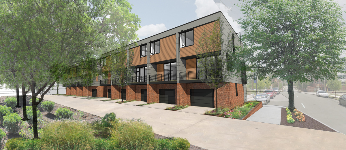
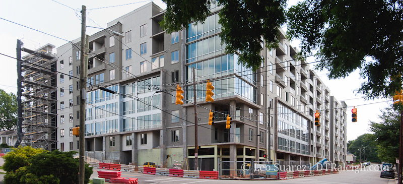
We haven’t looked at The Devon Apartments, formerly called 425 Boylan, for almost a year and a half. The scaffolding is down now and we can really see what this project looks like.
First, let’s get the naming straight. Taking a look at The Devon website, the new apartment building is being billed as The Devon 425 while its mate across the street, 712 Tucker, is called The Devon 712. I was told that the two apartment buildings will actually share amenities since they are all under the same company.
Construction was slower compared to other projects but there’s a lot of concrete compared to wood framing in The Devon 425. There will be a total of 250 apartments consisting of studio, 1 and 2 bedroom units.
Between the two Devon projects and the units nearby at St. Mary’s Square, this could be one of the most urban residential areas in the city. If you include the entire district as a whole, Glenwood South is turning into urban Raleigh’s place to live.