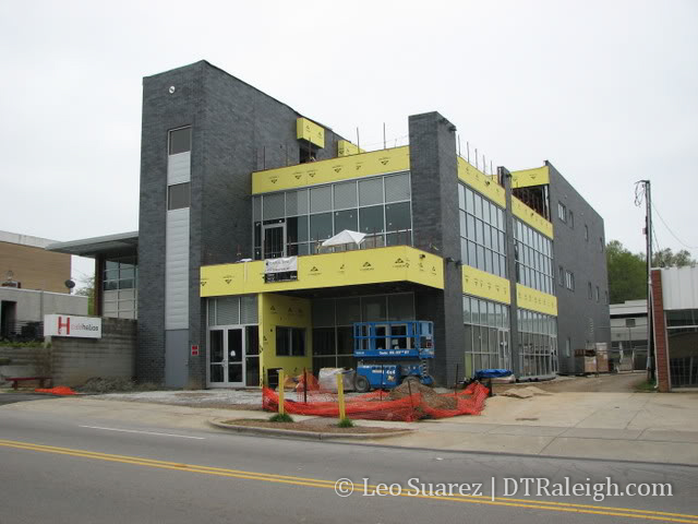
Spring is here and we should all have our eyes on Solas. The three story restaurant/entertainment building was reported back in February of 2007 as having a spring 2008 opening. Progress has been steady over the past year and I’m looking forward to this one.
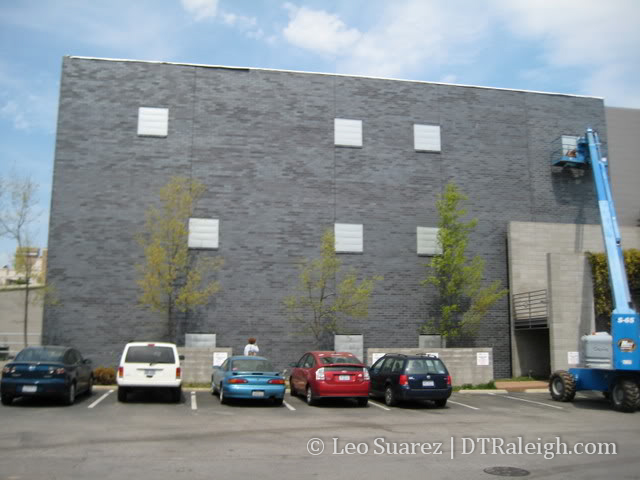
Use your downtown connoisseur skills to imagine the view from the top. You should get a wide view of Glenwood and be able to look over The Creamery across the street. I think the nightlife will eat this up. However, if I’m looking at this right, the core of the downtown buildings along Fayetteville St. will be southeast. If you look southeast from the top floor, you will get a nice view of a gray, brick wall. Did not think that one through did we now?

Thank you Solas for not putting up a boring wall. This one is subtle and not as bland as other walls around DT.
Comments
Comments are disabled here. That's because we're all hanging out on the DTRaleigh Community, an online forum for passionate fans of the Oak City.

Your right. Your standing on the second level and looking at a wall instead of the skyline to the South, what the heck are these developers/architects thinking (what idiots)!
Surely they wouldn’t have overlooked that. Is there any way to contact the developer/owner/etc and ask them about that? Perhaps you’ll be able to go up atop the narrow wall?
Raleigh could use more murals downtown… That looks like a prime spot for one.
Maybe it was the light of day but when I passed it yesterday, those bricks had an interesting blue-ish color to them. Which, in this town, is at least a nice change from all the beige.
I heard at one point (last year, maybe?) that the Rockford was planning an outdoor balcony/seating area off the back of the restaurant. However, it was killed when the city demanded that Rockford provide more parking to accommodate the extra seating capacity.
There’s a difference between a boring wall and an ignorant application of aesthetically horrific window/air valves. Another architect and I were passing by it last week and wondered what those things were. That brick is a brick we used in the Apex Cultural Arts center and it’s gorgeous. These fake window/exhaust vents tacky up this fabulous wall. Sorry to disagree so harshly but those white squares need to go (or be black).