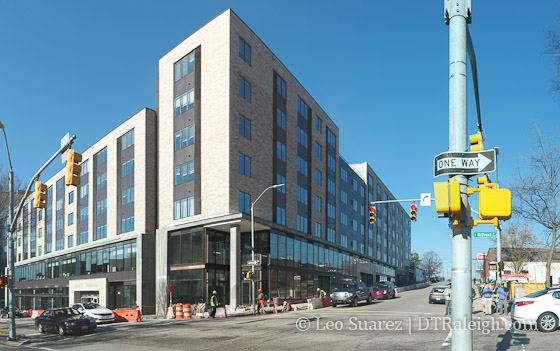
We haven’t looked at The L Building since the summer of 2014 and now this project is almost complete. The second floor offices appear to have tenants moving in and the sidewalks are being paved this week.
The southwest corner of McDowell and Davie Street look very nice in my opinion. The building’s retail spaces add some great urban form to the sidewalks. With so much morning and afternoon pedestrian traffic between the parking deck behind the building, maybe we’ll get a coffee shop here.
Should be soon before we can consider this project completed.

Comments
Comments are disabled here. That's because we're all hanging out on the DTRaleigh Community, an online forum for passionate fans of the Oak City.

In the first photo notice how there are two different lots of bricks used on the facade. Look on the shaded side and at the top floor of the building. Once you see how they don’t match, it’s hard not to see it each and every time you look at the building. I can’t believe that the architect and owner let that slide.
I don’t think you could design a more boring looking dormitory.
Wow John. That’s actually quite apparent now that you’ve pointed it out. The other thing that falls short is that nothing was done to conceal the bare masonry wall of the parking deck that rises above and behind the “L”. See picture two. I was thinking they’d install a facade? Good grief, smear some stucco over the cement blocks or at least have NCSU design school come up with some more nice banners to hang! This shortcoming is definitely visible when standing up the hill where photo was taken.
Can we get some rooftop Gardens…! I park in this garage daily, the office retail space looks great, the apts on the other hand look bland. Some decks and rooftop gardens or patios would have been awesome.
I’ll just be glad to have all the lanes (and sidewalk) on Dawson opened again. Whew, the backups at times were horrendous during the construction!
^Er…I meant McDowell. You know what I meant ;-)
If you look at their website, they advertise a rooftop patio as an apartment amenity……
The rooftop patio is on the Davie street side. I spoke with one of the construction workers who informed the “terrace” looking area on McDowell street doesn’t have a door access. So… useless. I would suggest some form of “green” roofing with light landscaping that can be seen street level and hides the remaining parking deck.
@Stew. The sad thing is that that is not the only place where the bricks don’t match. If they had thought it through better, they could have at least consolidated all the mismatched bricks on one side or section of the building.
In the end, let’s hope for some nice shade trees to surround the property to distract from its blandness and miscues.
When all one can say about it as a positive is that it’s better than it not being there and having that garage exposed….well…that’s pretty pathetic.
Basic developers build basic buildings. Remember, kids, it’s Greg Hatem’s downtown. We just get to use it every now and then. I wonder how livable these units will be when there is a concert going on across the street?
I like it compared to other stick built crab. Plus that site was hard to work with. Name something better plus you can walk to Poole’s dinner.
BC, I can easily name a place that offers accessibility to Poole’s Dinner, Fayetteville Street and the R-Line. As a bonus, it offers great views and the structure is much sturdier: The County Jail.
@Ernest, Yes you are right they got a great view & 3 meals a day (not Poole’s) plus great security system. That area is going to change when the hotel starts on the old turn-key tire site. That should benefit the convention center. I am really impressed with the Lincoln apartments. They are looking great. Just need a new arena for hockey downtown.
Retail space looks nice…. that’s about all I can say that’s positive about this building. Kinda like the Edison Apartments going up…. just happy to have the storefront space….. that’s about it. A resounding “meh”
You knew this project would not be one that would offer something nice to look at. They were stuck with matching the building to the initial Wake County parking garage which was not pretty in the first place. I’m sure there was a way around my excuse for a bland building. But on the positive side, score one for another more up to date building that will have tenants that provide economy to downtown. Onward!!!
I think it looked better when it had those colorful banners and murals on the side of the deck.