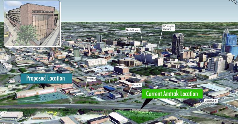
Last night, Raleighites had a chance to hear a presentation about the upcoming Union Station and to comment on some of the high level concepts being drawn up for the new station. This was the first of several meetings to show off the work as it progresses towards a more complete design.
I want to reiterate the fact that this meeting was indeed very high level and nothing concrete has been put into plan. The presenters spent about 30-45 minutes going through slides of the warehouse district and the viaduct building itself. Maps showed very rough concepts that the station will have, things like a mix of gathering space, retail, and operations space.
The presenters emphasized that they wanted the entrance to be grand and inviting. Borrowing from a plethora of examples from around the world, it felt like Raleigh’s Union Station will try to have that big and open-style entrance that others seem to have.
The very first concepts, the ones that have been out way before this meeting, of the station layout are actually being challenged. More emphasis on the gathering space, making it bigger and more voluminous, was shown in the drawings. There also was, what appeared to be, more thought put into the parking lot layout than before.
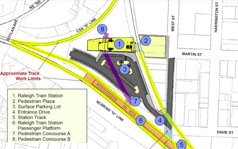
Here’s the original layout of the station area.
Notice the parking lot layout relative to West Street.
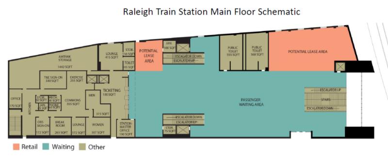
And now here is the original floor plan for the interior.
Here you can see the breakdown between the gathering space, shown in blue, the retail space, orange, and the office space, brown.
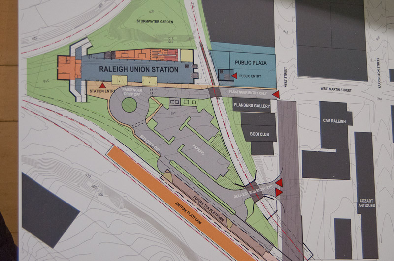
Last night, we had this new plan on the table.
The same blue area in the image above shows an elongated gathering space that goes from the front to almost the back of the building. This comes from a different layout of the offices and incorporating some of the upper floors of the northern part of the building. The larger gathering space, suggested to be lit up with lots of natural light, is a great idea and I hope the planners can deliver it.
The parking lot has been rethought with a second entrance to West Street and a traffic circle in front to keep vehicles moving and avoiding conflict with parking. This is definitely a step in the right direction as car/bus traffic flow is being thought of in a smarter way.
I’m hoping the entrance in the front, with a pedestrian plaza, will really get some extra attention. As soon as travelers arrive at Union Station, they will be stepping into downtown and the plaza needs to make a statement. I’m hoping visitors will stop for a quick second and feel like taking a photo of themselves.
Great stuff so far. Expect more details during the next presentation.
Comments
Comments are disabled here. That's because we're all hanging out on the DTRaleigh Community, an online forum for passionate fans of the Oak City.
OMG. The second design appears to eliminate so many parking spaces compared to the original design that the new station would not provide a significant increase in parking over the current station. If the new station doesn’t address the #1 failing of the current station, what’s the point?
What were your thoughts on the West Street Extension alternatives? Living in the neighborhoods west of the current Amtrack station, the at-grade crossing closure at Cabarrus that is present in both alternatives greatly concerns my neighbors and me. It effectively cuts off the pedestrian/bike connectivity of our neighborhoods from downtown, forcing foot and bike traffic on a cicuitous (and desolate) route around the closed crossing and, in the case of the road-over-rail alternative, makes walking to the depot area of the warehouse district a ridiculous detour.
a parking garage is still planned/called for within the warehouse district, in a lot a half block away. the good thing with both of these schemes is that they eliminated the notion of an immediately adjacent deck within the triangular wye area which had been proposed earlier on. That would have had a dramatic (negative) affect on the southern facade of the station. From what I can gather changing the at grade crossing on Cabarrus is extremely challenging, if not next to impossible, because of the elevations of dawson and mcdowell. That is one of the main reasons for the West Street extension, either above/below the tracks.
But the reality is: the garage is not funded and has not even been scheduled for design, much less construction. Nobody knows when it will open. In other words, there will be no incremental parking in the 2nd design for an indefinite period of time, possibly as long as five years. Bad idea.
I’ll be surprised if a public-private partnership doesn’t come to before then to bring more commercial and the parking. The rail work isn’t anticipated to be complete until late 2017 and a lot can/will happen before then… parking at the current station is only a real problem twice a year… I’ve lived down the street for twelve years and have seen that to be the case.
Only twice a year? You must be kidding. I or someone in my family takes the train once a month. Usually there is no long-term parking whatsoever, and usually there is parking for train dropoff and pickup only on the sidestreets.
A “Future TTA Platform” is shown on the site plan… I assume this is for the commuter rail since the LRT is suppose to stay on Morgan St. I’m curious how pedestrians arriving via commuter rail are meant to walk to downtown – doesn’t appear to be a clear path.
Building a parking garage on a surface lot in the warehouse district is definitely not insurmountable.
Regarding Cabarrus closure: I definitely see the drawback to the neighborhood, but I don’t think there is any alternative. Hopefully the West St tunnel is built to create a very inviting pedestrian experience.
The Cabarrus Street crossing is a safety hazard, particularly when trains back up over the crossing. Also, both freight and passenger will be able to operate at higher speed through the area — thereby reducing congestion on the tracks — when the crossing is closed.
I don’t think anyone would object to underground parking. Got another $5-10 million for the project? That’s what it would cost, I guess.
I wanted to go over the West Street Extension next week once the images of the two alternatives are posted. I will say with regards to the closing of Cabarrus Street that citizens should push for some kind of ped/bike crossing, most likely a bridge.
This is a similar request to the future closing at the tracks on Jones Street because of the high-speed rail. A ped/bike bridge is a want at this location.
As someone living on Cabarrus near the station, I am very concerned about permanently closing Cabarrus at the rail crossing. First and foremost, Raleigh should focus walkability and bicycle-friendliness. The pedestrian traffic on Cabarrus is significant including daily commuters, runners, and First Friday or Amphitheater crowds. I support the Union Station development, but I won’t be satisfied with any option that doesn’t protect the vitality of the neighborhoods already established in the area. The Raleigh Greenway already has examples of tunnels under major intersections and other options exist. My hope is that the next version of these plans reflect this important part of the community’s input.
I think the use of this building is _really_ awkward. Seems like a better plan would be to tear down Flanders and the other building, EAST of the triangle, and place all public access outside of the triangle. Treat the building kind of like the layout of Terminal A at RDU where ticketing, baggage claim, and drop off/pick up is done at street level. Elevated would be the gate where passengers would process their ticket, then walk on an elevated bridge across tracks and then walk down to the platform.
I worry that any heavy function taking place inside the triangle suffocates expansion of the main terminal (remember the plan to integrate bus connections?), drags vehicular traffic across an at-grade crossing of the east border of the RR triangle, and creates an awkward pedestrian plaza that forces all pedestrians to drop down into a hole, cross under the tracks, and come up on the other side.
How is TTA going to use that platform when the plan is for it to jump off the RR ROW at Charlie Goodnights and head down Morgan, completely ignoring the south and east sections of downtown?
Seems like a lot more time at the drawing board is needed.
(Not Daba – sorry – this stupid Mac keyboard grrr)
Has there been any mention of the “High speed” rail plan with this building? As I understand it that line would come from the west and curve north at the wye. Therefore a different platform would have to be built. Building a functional terminal inside of the triangle chokes out flexibility for this platform and track placement, as well.
Yes, the Southeast High Speed Rail (SEHSR) line to Richmond and points north would follow the current “S-line” freight corridor that you see in first drawing. The station design includes a stubbed tunnel that would be extended subsequently to reach the platform for SEHSR. However, the SEHSR platform will not be built until SEHSR is — which is in the very indefinite future. The SEHSR project will cost over a billion dollars and nobody knows where the funding would come from.
Regarding a ped/bike connection at Cabarrus: Make it a tunnel not a bridge. I suspect people instinctively favor bridges because of the fear of tunnels being dark/dingy/scary, but bridges are really just as bad in that respect, and much much worse in others. Here’s why:
First there are several precedents for pedestrian tunnels in Raleigh that “work”. First there is NC State. There are quite a few tunnels on our greenways as well.
Second A bridge has to climb up about 25 feet to go over the tracks and then descend on the other side. ADA requriements mean either awkward elevators or impractical zig zagging ramps. A tunnel has to descend only about 10 or 12 feet which could easily be accommodated by a gently sloping straight line ramp.
This is because a pedestrian tunnel only needs enough clearance so that people can go under it. A bridge needs enough clearance so that trains can go under it.
I would also advocate the same approach (build a tunnel) for the Jones Street crossing that will be closed as a part of the high speed rail project.
@anthony – i’m curious if you attended the public meeting and talked to the designers directly following the presentation about your concerns: parking, vision, vanilla, etc. what was the response?
why don’t we have the best of both worlds, a public and private venture to give Raleigh what it truly deserves. http://unionstationraleigh.com/ this is a link to an idea designed by a private citizen, it incorporates light rail, high speed rail, freight, and regional. It has opportunities for private business ventures. And it looks pleasing to the eye, if done right! I like the latest edition of Union station that came from the board meeting, but i feel as if it will be inadequate in a short amount of time. The downside to the idea in the link is that it might not get the kind of traffic to justify it right away. its a sharp double edged sword!
One immediate and insurmountable problem with the private citizen’s design is that it puts the station in the wrong place for the passenger trains that Amtrak currently runs. Back to the drawing board, I think.
Personally, I love the design and love the adaptive reuse of this neat warehouse. I highly suggest taking a tour of it if they invite citizens inside again. The (very very preliminary) design showcased some cool ideas for combining the historic feel with new innovations in transit stations.
I agree with others, the surface parking could be the downfall though. And I’ve always wondered how practical it is to make passengers go up/down levels 4 times to get to their platform.
I appreciate the effort that went into unionstationraleigh.com but it is amateurish and has little relation to the engineering realities on the ground and nothing like it could even remotely be built. There are issues with grades, vertical/horizontal curvature and spiral, railroad issues such as clearance between tracks and platform designs, clearance under bridges and over railroads, bridge pylons, property ownership, railroad permissions, and accessibility that the plan makes no attempt whatsoever to address. You might say these are details and can be worked out in the implementation, but they are actually 100% fundamental to the layout of the station. Not to mention no platform that would accommodate the Carolinian, Piedmont, or planned NCRR commuter rail is shown at all. Personally I wish the author/designer would move it somewhere else and either shut down the domain or sell it to the city or DOT. It is very confusing to the public (it’s the top link you get when you search for Raleigh union station on google).
I agree somewhat with Dana that this building and in fact the whole programming of this site as a train station is awkward. The only way to get into the station for pedestrians will be by going down and then back up a staircase. The platforms are 1000 feet apart, and to get to the platform, you must go down again, walk through a 500 foot tunnel, and go up again. This is a significant downgrade from the current situation, where you just walk straight up onto the platform from Cabarrus Street. This latest design is also worse than the original one since it’s an even longer walk from the street to the platform since the tunnels are connected to the back of the building rather than the front.
Some of these constraints may be inevitable, but I have to think we could do better. Perhaps the current plan could be considered as only part of an eventual station complex, but chances are this is all we’ll get for 50 years.
Why are we so set on adaptively reusing this building anyway, when it’s just an uninsulated, unadorned brick and sheet metal warehouse? If it were something like the Walker building housing Durham’s Amtrak station with timber pillars and roofing showcasing detail and craftsmanship from a bygone era, I could see it. But this thing is a windowless soulless monolith, the likes of which could still be built today with ease and little expense. Are we saving a lot of money by adaptive reuse? I have to think that we could do a better job with something modern and purpose-built without spending too much more money.
One constraint we face is the diamond with the Norfolk Southern line to Fuquay and Fayetteville. Getting rid of it and reorganizing the tracks would have yielded much more space to build platforms and a station, but NS doesn’t want to move it. I think they should push harder for a solution to this problem.
Thanks for your compliments on my website, AJ. Unfortunately, orulz is pretty spot on with his comments!
I keep forgetting that website is still up, and I appreciate orulz alerting me to the potential confusion it may be causing. Now that Union Station is actually moving forward and preliminary plans have been published, I agree that it is a good time for me to take that website down. The last thing I would want is to promote something that gives a false impression of what is feasible for the site. I no longer live in Raleigh, but will always love the city and enjoy keeping up with what is going on there (usually through this site).
I should say that I am a planner, not an engineer, so the plan I created was very much a vision rather than a concrete plan. Not only that, it was my first year of planning school, so even as a planner I was still fairly ignorant (hopefully I am slightly less so today)! I published the website because I hoped that it would get more people interested in and talking about Union Station, which was very much in the preliminary stages at that point and was not getting a lot of attention outside of places like this blog.
Since I made that website, I have learned a great deal about the site and the various constraints and problems that it presents, and I have grown a lot as a planner as well, so if I were to approach that project today I think it would look very different.
I am definitely enjoying all the discussion here about this project. It is a very tricky location to build a station and it will be interesting to see how things progress.
Hmm.. I just think its missing something to make it wow…
1. Is there going to be a lounge? I should hope so for the Carolinian business class.. And not a room but a true lounge.
2. The parking situation does not look any better. I would hope they are going for at least 350 spots. If not, there is no vision for growth.
3. I like the longer gathering area, but there needs to be retail and unique retail to include some highere end and mid end retailers. ( please including a gift shop just for NC amtrak items like patches, t-shirts, trainset a, kids coloring books, mugs, sandwich bags) and use the funds for that to advertise and promote train travel.
4. There should be at least 3-5 eateries in there… (BBQ, sushi, pizza, sit down restaurant, Starbucks, Wendy’s or Snoopys)
5. The tunnel to the platforms.. Ehhh.. If you gonna have platforms, make them accessible from the 2nd floor and have grand escalators from the gathering floor to the 2nd level.. And have the bridges (nottunnels) see through glass and go both ways to the commuter and SEHSR platforms (one each way) to allow for seamless transfers.
6. Make it open! Nothing worst than bumping into people.
7. Make a KidZone so they can go into a plays pace and not running around outside..
8. Have a bar
9. Terrazzo flooring showing Tobacco Road and state symbols…
10. Lastly, train status monitors throughout to provide up to the minute updates
Just some quick thoughts..
The design really would be a lot better if the pedestrian plaza wasn’t cut off from the station itself. It’s kind of silly to have people go down and up twice just to get to the trains (as has been mentioned before). I don’t see any way around it, it’s just kind of weird to have a rail line going right in FRONT of the station.
Maybe I’m looking at it wrong but the current rendering look like a single car garage. Fingers crossed this will be a building our city is be proud of.
Steve, there was talk at the meeting about that. The thinking is to “pull” the station over the tracks with some facade so that it feels like you are going down into it and not under the tracks. I felt like they are aware of this.
Leo, thanks. I wasn’t able to make the meeting. It’s really hard to make a judgement based on a ‘conceptual’ design that really isn’t very detailed at this point. If the plaza slopes down and the tracks are hidden, it’d probably be pretty nice.