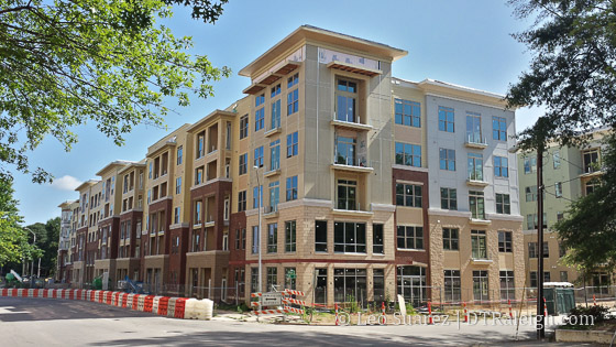
Elan Apartments on Wilmington Street in downtown Raleigh
I thought this podcast from Charlotte Talks called “‘Ugly’ Development In Charlotte” was an interesting listen. The same exact thing is happening in Raleigh and for most conversations in the podcast, you could replace “Charlotte” with “Raleigh” and it would still apply.
As the second fastest growing city in the country, Charlotte’s population is exploding and developers are trying to keep up. Hence, all those apartments cropping up around town. But some architects feel those building are too similar, too bland and because there are so many of them, they are beginning to negatively impact the look of the city. Those architects are suggesting stronger design standards need to be adopted and we’ll hear their ideas.
Listen to it on the Charlotte Talks website.
Comments
Comments are disabled here. That's because we're all hanging out on the DTRaleigh Community, an online forum for passionate fans of the Oak City.

Bland, common and boring, agreed. But I wouldn’t go so far as to say ugly…
These developments are five in certain locations. I think they look good and fit well in Cameron Village or Brier Creek. But they don’t belong in Downtown Raleigh or in North Hills. The Edison is just the worst and it’s a shame the city approved it.
Fine*
As someone who just moved here from Denver, I would not say that the apartment building shown above is ugly, but it sure looks familiar. Take a Google StreetView tour of new apartment developments around the City and you will see this basic shape, color scheme, brick use, etc. on nearly every one. It really got out of control there, hate to see it happen here too.
@Patrick – first of all, welcome to Raleigh! You will love it here. Second, maybe “ugly” isn’t the right word, but I think it’s filling in for repetitive/boring/unoriginal/lame/wasted potential/bad design/suburban/plain/beige/gross. Smash all those words together, and ugly sounds about right. City Council really needs to set some design standards put into place and not just approve anything that gets proposed.
@Jake, honest question…how can minimum positively (thou shall do at least) aesthetic design standards be worded and objectively enforced? I am familiar with Cary’s and I think of theirs as a negative aesthetic (thou shall *not do)…perhaps they think of it as a positive from a negative. Setbacks and building composition are largely covered by zoning already…but agreeing on materials and colors and lines is terribly subjective and I think hard to implement. I think Cary just provides a palette of approved colors of some sort? (correct me architects et. al. who know for sure. Anyway, what sort of specifics did you have in mind, because I clearly have a knowledge gap on the subject.
Thanks
@Mark, honestly, sounds like you know more than I do. I am just aware that there is very little scrutiny put into place from the city for buildings under a certain height, which is why I believe so many of the newly proposed buildings are all short and fat. It’s a shame. If you’re asking my personal design standards? Well, for one, I strongly believe that all new buildings in the downtown area should be required to include ground floor retail space. Sure, we don’t have a huge demand for retail in Raleigh right now, but we will, and all these buildings without any ground floor (the one pictured above, included) will be pretty useless when that time comes. But that doesn’t have much to do with the look – I’m tired of these garbage suburban apartments that look like the designer couldn’t decide what materials the exterior should be made from, so they make one floor brick, another floor beige stucco, etc (look at that…. thing… up there, what the hell is even going on with that exterior?) I get the whole “multiple buildings in one” look – the Dillon looks like it will do a good job with that premise. But these apartment buildings just look half-assed. I think Raleigh has enough bricks, enough of that. As far as colors; NO MORE BEIGE! Jesus! It blows me away how many new buildings are going up that are beige or brown. I think the entire city could agree on that. Glass is nice, the SECU building and Charter Square are nice examples of classy glassy buildings (Charter Square I give a pass on being short and fat because that really is as tall as they could go given the underground parking deck). PNC Tower is OK, if not a bit boring. Personally, I just think there needs to be height minimums for certain areas of downtown (and not height limits, like we currently have). Certain exterior materials should be limited (brick, concrete – for the love of god). I also think these wood built structures should be limited to OUTSIDE downtown proper – buildings going up downtown should be built with steel aka built to LAST. And to repeat, we need to require ground floor retail space in all new buildings downtown. That’s my biggest wish.
@Jake, cool, thanks for sharing. You’re hitting on some universal concerns around here for sure. I can comment on a thing or two…the squat look is because I am pretty sure Raleigh will only allow up to 5 floors of stick construction. Sometimes we get 5 on the ground like Elan, somethings 6, with a retail ground floor that is a concrete pedestal like Grammercy or Edison. These megablock apartment buildings are mostly built to offload to REITs once they are mostly leased up. The developers make the most fast money if they keep the construction cost down by not going to a height that requires steel or reinforced concrete. Devon, at 8 stories, actually is all poured concrete and much nicer as a result, but cost a bunch more per sqft to build. The predictable level of design here makes me feel something between sad and mad and your thoughts on the specific buildings you mentioned are exactly mine. My personal wish is that there were more, tallish, but small footprint buildings like you’d see in NYC. This would give us more chances to get different designs along a given street front. The trend to consolidate entire blocks into a single development, is at least part of the problem here. Leo’s post of the Monarch concept building by Remedy diner, accomplishes both, a) a design variation we’ve not seen much of and 2) works within a given, small lot without consolidation. I’m a huge fan of that path to developing around downtown.
I think all of the sprawl outside of the beltline is ugly. The Targets, Walmarts, gas stations, strip malls, storage shed facilities, fast-food chains, Uhaul lots, parking lots, car lots, tire dealerships, auto-repair joints, big-box stores–the dirty, nasty, yucky, UGLY sprawl. And we’re wasting time complaining about buildings that do a decent job at creating density and are, comparatively speaking, a lot nicer then the aforementioned BS; why are we doing that? Obviously design standards in this city are close to non-existent and we should be so lucky that we at least are getting some density (and half-way nice buildings) instead of the former. Until the City (nation) really adopts some sort of incentives for promoting good design (aka tax incentives, subsidies), we will continue to go down the same path of lackluster development. So get out there and do something about it instead of just complaining that these buildings are ugly. Go to the city council meetings and make your voice known and ask/fight for something better.