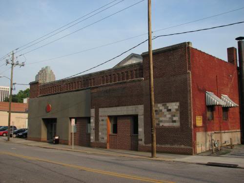
The future site of the Contemporary Art Museum
Comments
Comments are disabled here. That's because we're all hanging out on the DTRaleigh Community, an online forum for passionate fans of the Oak City.

The future site of the Contemporary Art Museum
Comments are disabled here. That's because we're all hanging out on the DTRaleigh Community, an online forum for passionate fans of the Oak City.
Comments are closed.
We need more places like this to bring culture to our city.
Sorry, the new design is laughable, no, UGLY (go to the CAM site, what are those windows suppose to be?). This is another example of a local architects lack of vision (another downtown Raleigh mistake)
Anthony,
“What are those windows supposed to be?” What windows are you referring to?
Are you an architect? Tell us why this is lack of vision via the architects. Please humor me.
I looked at the PDF linked on the site, and I don’t get what he’s talking about. I think it looks OK. Just saying.
WoW! Renovated Ugly Warehouse!! Can we please get more!!!
I think is a good start. You can’t generate enthusiasm and raise funds until you start bringing in some noteworthy exhibits and for that you need a place. Let’s concentrate on the content and the rest will follow.
Well Magnus, I know that the NCMA is planning a building dedicated to NC artists. That might be your venue.
Yeah, Lucy, I am still holding my breath waiting for them to come beg me to set up a special exhibit of my work. ;-p
(I think the rule is I have to die first before anyone notices it)
You guys do know what this photo is showing? Half of the asbestos siding taken down (it’s actually all taken down now, was two weeks ago).
Travis,
“WoW! Renovated Ugly Warehouse!! Can we please get more!!!”
please elaborate….
Yup, that pic was taken on 6-25-08.
As much as I truly hate to be negative…Sarcasm was the intended tone. I guess im disappointed with this project. But, yes it is good to get things in the right direction.
Yuck. They could at least paint it a color instead of “suburban mauve…”
As an artist with a studio less than a block away, I don’t know if I care what the place is going to look like anymore as much as I just want them to get it DONE and built and bringing (more) people to the neighborhood, for Pete’s sake. We’ll never reach consensus on the aesthetics of the building… let’s just get the ball rolling. Please.
I am not ecstatic of the new look. I know that CAM tried to bring residences and expand/enlarge the current facilities, therefore they deserve credit for the effort, but the new design isn’t much to talk about. Hopefully, some other developer will join CAM and help the original vision materialize at one point in time. This is a great location for something more visible. Something that will help CAM promote itself better. I wish them best of luck, one way or another.
They ought to just get it built and then Phase II commission a local artist to fix the exterior.
I’m not saying that Philadelphia is a better city in any way but one thing they do well is leverage local artists to brighten up building exteriors.
Just walking around, you see unexpected outbursts of creativity like this all over:
http://visualresistance.org/photos/images/philly2.jpg