I finally made it through the Downtown Raleigh Alliance’s analysis and strategy report on retail, read the whole thing here, and there are lots of topics to go over. I thought their recommendations on signage was something I hadn’t thought of since I can’t view downtown through a first-time visitors’ eyes. The report suggests:
If the Downtown core is to become a truly alluring and exciting visitor destination, one that, for example, beckons conventioneers to head northward on Fayetteville Street, the City Council will need to be willing to accept bolder, more dynamic signage appropriate to this goal, as recommend in the Comprehensive Plan. Indeed, this will be critical to the fate of Fayetteville Street as a retail location, which rests partly on its ability to lure conference attendees and daytime workers from its southern end.
The report mentions that the 100 block of Fayetteville Streeet is not as active as the higher ones and that signs could attract visitors from the convention center and hotels down towards it. I always thought the grand capitol building standing right at the end in plain sight was reason enough for people to walk all the way down but maybe not. On a walk yesterday I made a point to look out for the signage along Fayetteville Street to see what our current situation is like.
From a pedestrian view, Fayetteville Street does lack some signage. As you walk down the street, it is a mystery as to what the next shop may be. I think some may still like this approach, it would be like exploring the street to see what it can offer you. However, with signs coming out over the sidewalks, a pedestrian could view many options and possibly make a better decision on where to go.
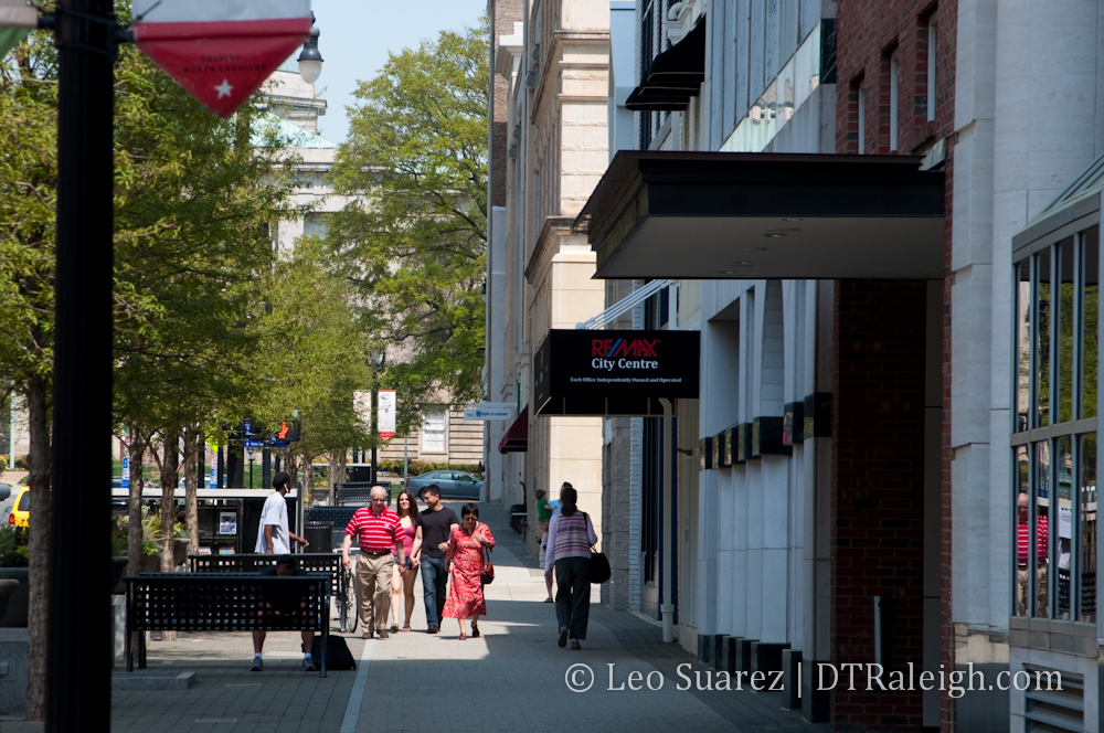
A pedestrian looking down the street here can’t see much.
It’s kind of like the difference between ordering the buffet or ordering off the menu. At a buffet, most new people look around to see what is available then decide what to eat. A menu shows you everything available easily, then you decide what you want. Signs that can be easily seen by pedestrians can be the “menu” along Fayetteville Street.
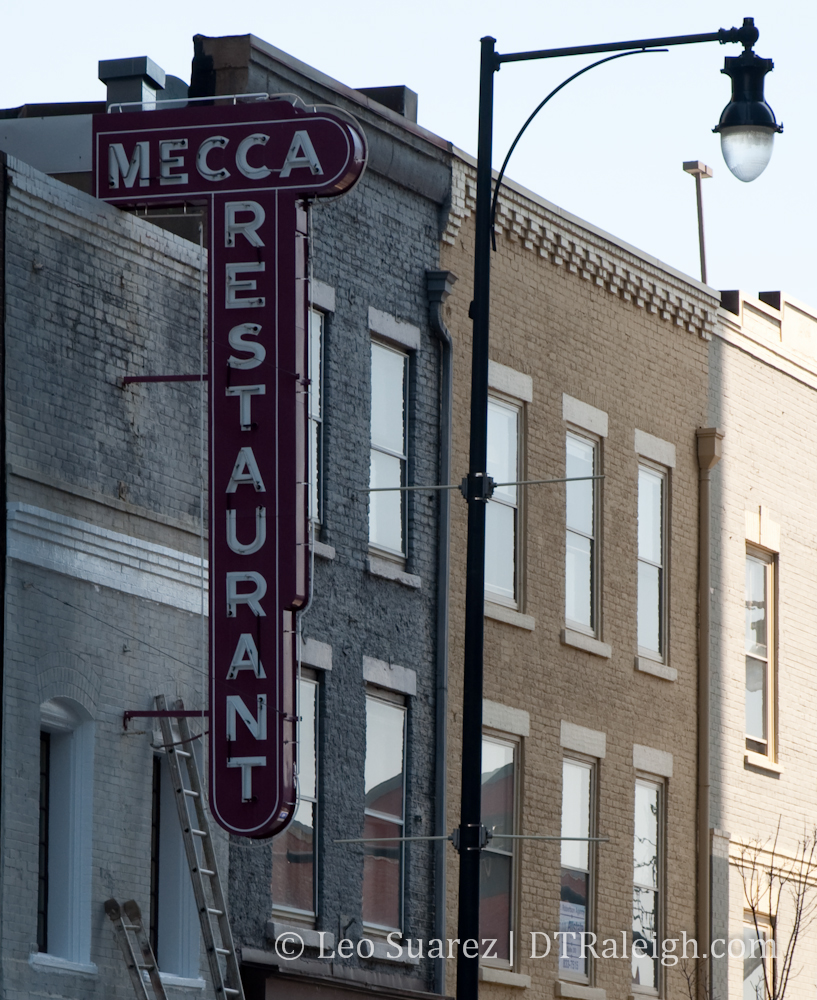
But presenting this “menu” is probably the real touchy part of this conversation. They definitely don’t make signs like they used to (see the Mecca picture) and in my opinion, you’ll hear a big outcry against anything that’s too bright and bold. If left unchecked, a busy street would be overwhelmed with large, bright signs competing with each other to get your attention. So we need to reach a balance here. At the bottom of the Downtown Raleigh section of the comprehensive plan are some suggested guidelines for signage: (page 49)
Signage should be compatible in scale, style, and composition with the building or storefront design as a whole.
Diverse graphic solutions are encouraged to help create the sense of uniqueness and discovery found in an urban, mixed-use environment.
All mechanical and electrical mechanisms should be concealed.
Signs should not obscure a building’s important architectural features, particularly in the case of historic buildings.
Signs should be constructed with durable materials and quality manufacturing.
Sign bands above transom and on awnings are preferred signage locations.
Only the business name, street address, building name, and logo should be on an awning or canopy. The lettering should not exceed 40 percent of the awning area.
Illuminated signs should avoid the colors red, yellow, and green when adjacent to a signal controlled vehicular intersection.
Allowed sign types: channel letter signs, silhouette signs (reverse channel), individualized letter signs, projecting signs, canopy/marquee signs, logo signs, awning signs, and interior window signs.
Discouraged sign types: signs constructed of paper, cardboard, styrofoam-typematerials, formed plastic, injected molded plastic, or other such materials that do not provide a sense of permanence or quality; signs attached with suction cups or tape; signs constructed of luminous vacuum-formed plastic letters; signs with smoke-emitting components. Changeable copy signs are prohibited.
I’m sure these guidelines can be interpreted in many ways. Too restrictive? You be the judge.
I believe that word of mouth is still more powerful then an attractive sign that lures someone in but thinking about new visitors to downtown, proper signage is important for Fayetteville Street. New visitors may feel more comfortable knowing about all the options in downtown and it only helps to land repeat visits in the future.
Comments
Comments are disabled here. That's because we're all hanging out on the DTRaleigh Community, an online forum for passionate fans of the Oak City.
This may not necessarily be a signage related comment, but The Mint could benefit greatly by a “something” that screams its existence… A better, more visible sign, and definitely tables along the Fayetteville Street side would be great.
Maybe if the Mint had a smoke emitting component.
A barrel monster robot dressed in a suit and tie w/ a monocle that walked around greeting street patrons.