If you have been lurking around Hargett or Wilmington St. recently, you may have noticed some holes in the sidewalks. I’ve started to notice more and more of these wood covered holes at the intersection of Fayetteville and Hargett, Wilmington St. near the museums, and near the Moore Square parking deck. At first I thought these were the parking meters that we have discussed before but that would be too quick a move on the city’s part. It finally hit me though and these holes have to be the locations for the new downtown signage that will go up soon.
The signage was approved last year and the city’s website has all the info. Looking at the pdf files confirms that these holes will have new signs to help people get around downtown Raleigh. Here are some key links for those that want more info.
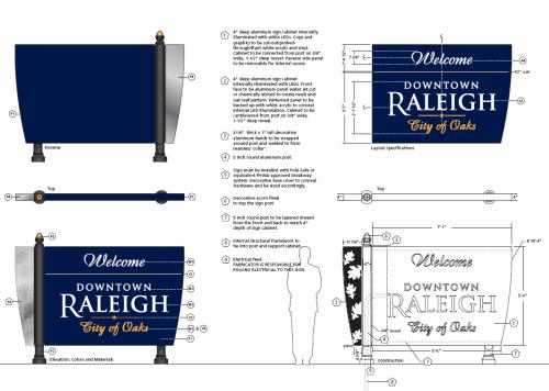
- Sign design drawings
- Signage locations map
- Signage messages
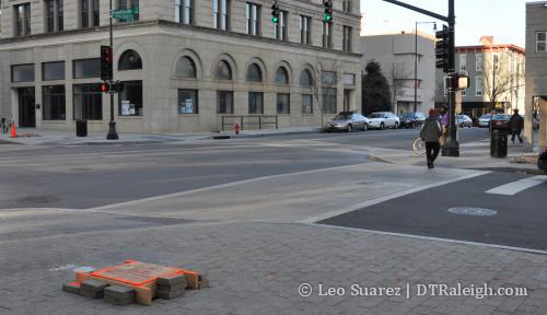
Three holes at Fayetteville/Hargett St.
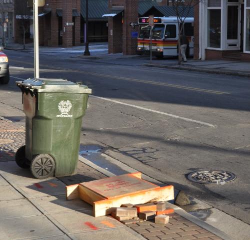
On Hargett St. across from the bus station.
Comments
Comments are disabled here. That's because we're all hanging out on the DTRaleigh Community, an online forum for passionate fans of the Oak City.
Blue?: This is not slumdog Durham. What a color to pick! At least go with Hurricanes and NC State Red!
I mean its just a sign. I’m not really sure what the big deal is.
signs look great, its all about making downtown “user friendly”!! Dark Blue is a good choice, it would have looked obnoxious in NC State Red (and I am an alum)
Blue is a soothing color and promotes a “hey, let me help ya find your way” attitude. Red is a lot more brazen and less friendly. The opposite of what we want in this type of signage.
I too am a NC State alum and agree that red wouldn’t work.
^ Yup. Besides, signs all around ncsu’s campus are already red. The city would want to make sure the areas are differentiated.
And some of the remaining leftover signs around downtown (circa early 90s) are blue and black too. So it’s nothing new as far as color schemes go.
No matter if the sign was NCSU/Hurricanes red or Carolina blue, there is only one word that describes these 5 foot tall, suburban, shopping mall signs:
UGLY!
Well if you don’t like them then you missed your opportunity a long time ago to give input to the city on them. If you’re going to complain about something, cite what you’d do differently.
I like them. They give a kind of “old time” feel to things. They also match the street/traffic poles going up everywhere.
Hope they get them up soon. With warm weather arriving, activity downtown is gearing up…now would be a good time to get them into the ground.
I just noticed that the sign on Person St. near the Krispy Kreme is facing the wrong direction!!! People driving the wrong way down Person (which I have seen on more than one occasion) are going to have a hard time finding Seaboard Station and Peace College down Polk St. Doh.
^Doesn’t surprise me that some will be installed wrong. Guess you can report it to the city. The city website link in the second paragraph (above) has contact information. We should definitely report any we see that are incorrect.
the city knows about the sign facing the wrong direction and the contractors are fixing it. all signs should be up by mid-april.
thanks for the feedback!
Elizabeth, thanks for letting us know. We appreciate the information.
I haven’t seen the signs themselves or seen what’s on the signs facing the seemingly wrong direction – so I may be wayyy off, but is there any chance they are pedestrian oriented?
Elizabeth…keep up the good work! The signage around downtown has really improved lately. Not just the wayfinding signs, but new street signs seem to be popping up lately. Hopefully all those suburbanites’ worries of “I always get lost downtown” will disappear! :-)
[…] Look for new wayfinding signage in Downtown soon […]
[…] picked purple? Posted on March 23, 2009 by robynlynn i think the new downtown signs are handy, but seriously– why the heck are they […]