Hello, Raleigh! Since launching the New Raleigh Flag website a couple months ago we’ve received lots of questions online and in person about the new flag campaign and the flag’s design. DTRaleigh has graciously offered us this opportunity to respond to some of those questions publicly on this forum. Thanks to everyone for your support and interest. Here we go:
Q: Where is this project coming from? What’s the motivation behind it?
A: Raleigh is a vibrant, thriving city with a rich history and a promising future. Raleighites love living here. We’re proud to claim Raleigh as our home town. What if we had a unifying symbol that served as a visual expression of this civic pride? We have an opportunity to establish such a symbol by adopting a new flag. A flag with a simple but memorable image can provide a sense of identity – something that, when you see it, makes you say “yep, that’s Raleigh.” That’s what we’re after.
Raleigh residents have long felt that the city could have a better flag. Our historic flag has been around for 120 years but has never been widely used. The prospect of designing a new flag came up in the Raleigh community six or seven years ago. There was a lot of chatter about it online. People posted new design ideas on Twitter and Reddit. The matter was discussed by the city council. But the conversation fizzled, and in the end nothing came of it. With time on our hands during the pandemic lockdown, a group of residents resolved to revive the initiative to take up a new flag. This campaign is the result of that effort.
Q: What’s wrong with our current flag?
A: The first step is admitting that we have…well, let’s call it…an opportunity. Our historic flag has a charming story behind it, but it doesn’t function well as a flag. It doesn’t follow the principles of good flag design – it’s too complex, it’s difficult to produce, and its details get lost when the flag is glimpsed from a distance. For these reasons the city hasn’t seen widespread adoption of the historic flag.
To see a counter example, check out the flag of Durham. If you visit Durham you’ll find this flag and its image all over the place. Attend a Durham Bulls game and you’ll see tons of people wearing representations of the flag. Durham has really made their flag work for them. They’ve embraced it as their symbol. By contrast, how frequently do you see the historic Raleigh flag flying around town? How often do you see anyone wearing images of the Raleigh flag, or using it as an icon? The complexity of the historic Raleigh flag makes this sort of adoption impractical.
Q: But the old flag is endearing. And it’s part of our history. Can’t we just keep it?
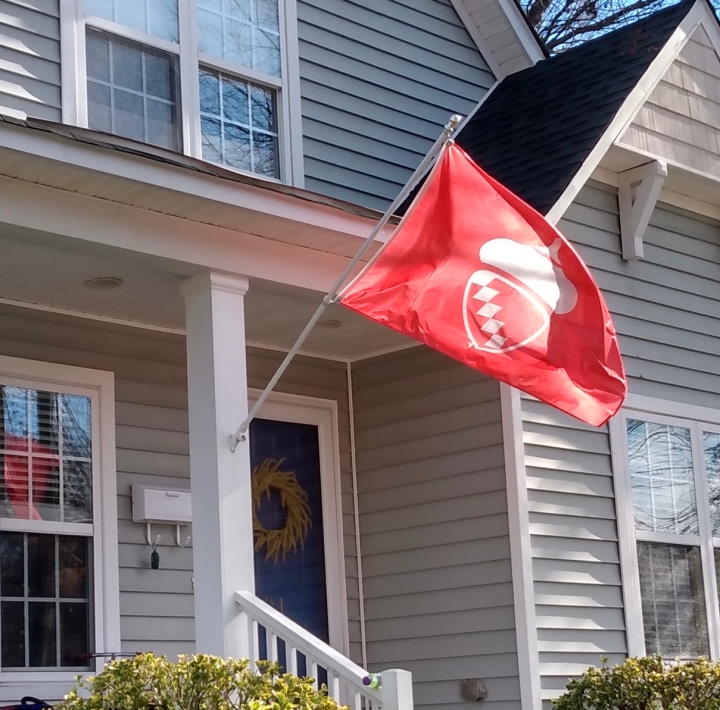
A: If you have an affinity for the historic flag, by all means, fly it! But we can complement the historic flag with a more recognizable standard for the city. A good outcome would be for Raleigh to do what Charlotte did and adopt a new, simpler flag as an alternate flag to live alongside the historic flag. That way the historic flag can remain an official flag of the city and can continue to be used ceremonially. And the new flag can be flown wherever a simple, instantly recognizable banner is preferred. The new flag’s emblem can also be adapted and used in other contexts, such as on clothing and other personal items.
Q: Isn’t it weird for a city to adopt a new flag when it already has one?
A: Not at all. In fact many cities have adopted new flags over recent years. As awareness of good flag design principles has spread, cities across the country have undertaken revamps of their flags, resulting in some striking new designs. You can find examples on our website.
Q: Why wasn’t there any public input into this?
A: This is public input. This is a grassroots movement expressing the opinion that we can have a better flag and this is how that flag should look.
Q: Shouldn’t we have started with a design competition, like the ones Milwaukee and Lincoln held?
A: We’re already happy with the new design and would like to have it adopted. And in any case, the initiators of this project wouldn’t have had the time, money, or visibility to facilitate a large-scale design contest. But if someone out there would like to organize a competition, please do! We’ll be happy to enter our design.
Q: How did you choose the colors and design elements on the flag?
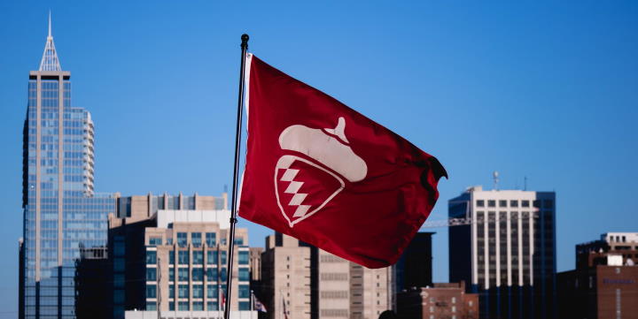
A: We wanted to stick with the themes expressed on the historic flag: that Raleigh is known as the City of Oaks and is named for Sir Walter Raleigh. The acorn embodies the City of Oaks theme. The diamonds are taken from Sir Walter’s coat of arms, which is a red shield with five silver diamonds in diagonal. In the new design we reuse the colors from the coat of arms and the historic flag. We wanted to retain the essence of the historic flag, while boiling its devices down to a simple, eye-catching emblem.
Q: Why doesn’t the new design include other elements from the historic flag, such as the deer?
A: A deer serves as the “crest” in Sir Walter Raleigh’s heraldic achievement, which is depicted on the reverse side of the historic flag. We omitted the crest and other elements of the achievement in an effort to keep the new design uncluttered, heeding a basic principle of good flag design. Detailed images are out of place on flags. For instance, city seals like the one shown on the front of the historic flag don’t work well on flags because they have too much detail to be made out at a distance. They’re better used on paper documents, for which they were designed in the first place. So instead of reproducing the seal with the oak tree in our design, we captured the City of Oaks theme with the acorn.
Similarly, while heraldic achievements can contain fascinating and fanciful symbols like Sir Walter’s deer crest, achievements are intended for display in a stationary context, not on a moving flag. Historically, heraldic achievements were commonly exhibited outside the tents of knights or other combatants, where passers-by could pause to regard them and learn about their owners. In more recent times, achievements typically appear as plaques on walls or carvings above doorway lintels. In these fixed settings, a viewer can study an achievement at leisure, taking time to appreciate its details and their symbolism. We’d love to see Sir Walter’s heraldic achievement displayed around the city on plaques and statuary. But the achievement has too much detail for a flag. A flag needs to be simple so it can be immediately recognized at a glance. For this reason we omitted the crest, torse, and motto from the new flag design. We reused only the coat of arms itself – the shield – because the coat of arms is the key component of a heraldic achievement and is always guaranteed to be unique to its bearer – in this case, Walter Raleigh. In this way we captured the two main themes of the historic flag while keeping the design free of other trappings.
Q: Why does the acorn’s cap look so smooth? A real acorn cap is bumpy.
A: Of all the questions we’ve gotten, this one is probably our favorite. It’s true; the acorn isn’t anatomically correct. We stylized its body, giving it a shield-like shape to better integrate it with the coat of arms. And we rounded the cap to make it flow with the curved shape of the body. As for the lack of bumpiness: any detail added to the acorn would increase the cost of construction of the flag, because more detail means more cuts must be made in the flag material. And it’s hard to make out this sort of detail when a flag is moving in a breeze at a distance, so it’s not worth the cost. We therefore went with smooth lines all around. We feel we’ve struck a good balance between style and simplicity, omitting unnecessary details while still coming up with a cool emblem.
Q: Wouldn’t it have been better to move on from the City of Oaks and Walter Raleigh themes and come up with something completely new and different?
A: Throughout Raleigh’s history its identity has been associated with oak trees and Sir Walter Raleigh. The city retained this identity even as it underwent great change through the past centuries. While we look forward to the amazing things we’ll accomplish in the future, and to seeing what Raleigh will become as it continues to evolve, we cherish the symbolism that the city has carried through history to our present day. We’ve sought to preserve that symbolism while adapting it into a modern, iconic emblem on the new flag. We love the result. And we must ask: If not this symbolism, then what?
Q: Are you just trying to make money from this?
A: No. The flags and other gear for sale on our website are being sold at cost. The flag design isn’t copyrighted. It’s in the public domain and is free for use by anyone, even for commercial purposes. Our mission is simply to bring the city a great flag – not to make money. If anything, we’d love to see local merchandisers earn revenue from flag-themed gear.
Q: So what’s the plan? How will you drive this to adoption? Will flag-waving crowds be marching to city hall soon?
A: At the moment this is a social issue rather than a political issue. We need to continue to build awareness of the movement and promote social adoption. As more people begin to fly the flag and display its image publicly, political adoption will flow naturally from there.
Q: Okay, I’m on board. How can I help?
A: Tell your friends! Follow our social media accounts and spread the word online – every post, share, and re-tweet builds awareness. Buy some swag and sport it around town. And, of course, buy and fly a flag!
Q: I have some ideas. How can I reach you to share them?
E-mail us! We’re always looking for ideas and would love to welcome new team members. You can reach us at info@newraleighflag.com.
Comments
Comments are disabled here. That's because we're all hanging out on the DTRaleigh Community, an online forum for passionate fans of the Oak City.