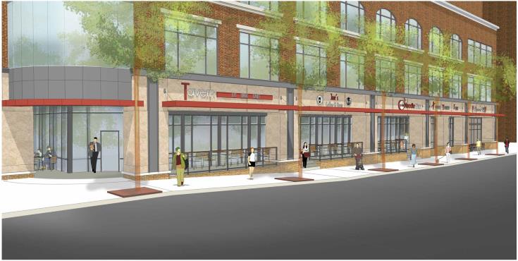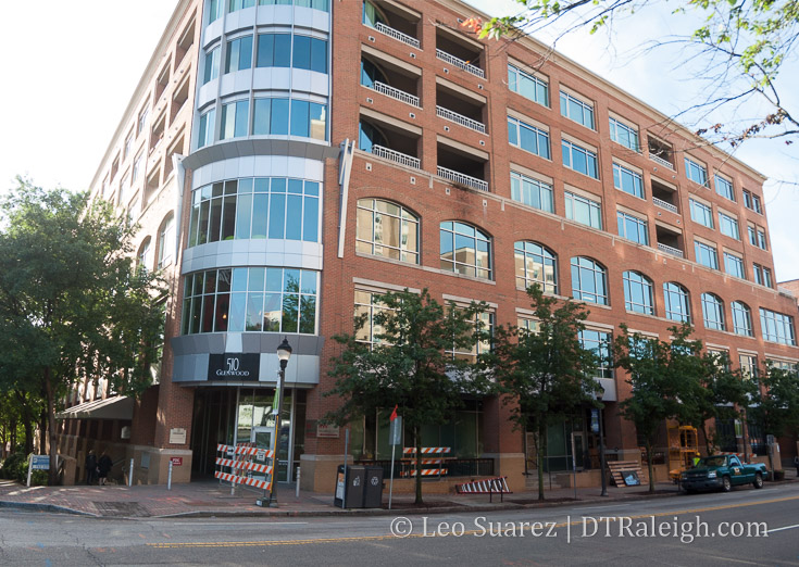
Rendering of 510 Glenwood
Work has already begun on some exterior renovations to the ground-floor facade of 510 Glenwood. Less columns and a more defined outdoor seating space seems to the be at the core of the plans. The original design made the entrance ways darker and less inviting, in my opinion, and I bet the new design hopes to remedy this with a more open approach.

510 Glenwood, May 2017
Comments
Comments are disabled here. That's because we're all hanging out on the DTRaleigh Community, an online forum for passionate fans of the Oak City.

This new design reminds me of the CVS on Hillsborough st in Raleigh.
So, it looks like they are changing some finishes and that’s about it. Maybe the lighter colors will make it appear more open?
Maybe these changes will help restaurants from constantly failing in these spaces.
It looks like they are sort of pushing the available interior space out closer to the actual edge of the building footprint. You can’t easily remove columns on a building of this size but you can make them feel like they are not there. Closer to what the Pho place already did. Brad as far as why so many places failed IMO, is the recent incarnations all felt super generic. The first round of places (Red Room etc) were coller but suffered from the popularity shift to Fayetteville St I think. 510 Tavern (and the others newer attempts)just felt blah. To add to that place’s problems in particular, one night they were advertising a beer special…Budweiser bottles, $6. Seriously? That’s the special price? That place had failure written all over it.
I’ve always felt that those ground floor spaces are too large so therefore it’s harder to make it work. I wonder if the former 510 Tavern space couldn’t be split in two for smaller shops or specialty foods. Where can you get a good dessert on Glenwood? A Bittersweet-like shop should make a play on Glenwood I think.
The N&O reports: “They’re removing half the building’s first-floor columns and adding big red awnings to frame each storefront. Large trees blocking visibility from the street will be cut down and replaced with smaller ones, and a new staircase will be installed giving direct access to the parking deck’s entrance, used by Hampton Inn hotel guests.”
http://www.newsobserver.com/news/local/community/midtown-raleigh-news/article151352692.html
Thanks Tim. You’re post made something click for me. I’ll preface this by saying I do like the building. It’s solid and should stand the test of time. But, the problem is in the word storefront…there are no storefronts. It’s like a tiny mini-mall with limited access to a breezeway that then accesses the spaces. I think it’s retail spaces are hurt by the fact that they do not directly connect to the sidewalk/street. Recessed spaces for retail, I think, are not optimal. Pull the retail facades out flush with building’s exterior (eliminate the breeze way essentially) and I believe they will be much more viable. Still wondering how the column removal is going to work….I guess I have new lunch time walking loop to keep tabs on that…
I miss Red Room and Bogarts. Nothing else in those two spaces has worked for me.
If anyone’s interested, DTR released its State of Downtown report. https://issuu.com/downtownraleighalliance/docs/sodfinal
I went to Red Room twice before I moved down here. So sad it closed. Everything that keeps failing after that seems to be fancy/trashy club/bar that wants to serve food during the week. Maybe actually putting good restaurants would make people go there. St Jacques is in some terrible strip mall outside of downtown, and is a successful restaurant because people actually want to go there.
Those transparent trees look really cool!