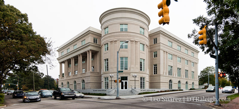
The new North Carolina State Bar headquarters building has been completed on the corner of Edenton and Blount Streets.
What was just a surface parking lot a few years ago is now a building with classical architecture. The state bar moves out from their offices on Fayetteville Street to this new building a few blocks away. You can see a before photo of the site at this 2011 blog post when ground was broken.
New NC State Bar HQ Construction Begins, Deals Final Blow To Former Baptist University
Comments
Comments are disabled here. That's because we're all hanging out on the DTRaleigh Community, an online forum for passionate fans of the Oak City.

the ugliest damn building with the most annoying and frustrating lane closures during construction for the longest damn time.
I can’t speak to the second part, but I don’t agree with the idea that it’s ugly. Is it grand? No, but it’s at least not another boxy, J Daivs building. It is kind of boring, but I wouldn’t call it ‘ugly.’
I don’t find this building ugly at all. It’s different than all the other cookie cutter crap projects that keep getting pushed by developers, so I quite rather like it.
It’s not ugly, but it’s a relic, nothing but cake decorating. What’s wrong with looking like 2013? This is an architectural cop-out. I thought the parking lot was a better use of the space.
I’m surprised that people don’t like this building. I think it’s the 2nd best building that was built in 2013 in Raleigh. First being the new SECU building.
@SR I agree with you. Some people just like to moan about everything. Apparently it’s 2013 so everything has to look exactly the same.
For whatever it’s worth, I like this building. The architecture fits nicely in that area. Sure, the architectural style is not unique, but the building is far from ugly, IMO. I can thing of at least 20 buildings that I would call ugly before I get to this.
Why does every building have to be a glass box now a days. Appreciate that the Bar was willing to spend a little more money on a look that wouldn’t go out of style in a decade or two, and will age well. My only concern is the lack of trees on the sidewalk. I don’t think I can see any place to plant them.
Put me down for a “like”. DAT makes a good point, though. A couple of big trees, one at either side of the big cylinder, would soften the transition between the square sides and the round center.
It’s pretty ugly. If they were going for a greco-roman look, they could’ve at least made the outside 3-dimensional instead of a flat cartoon of what it’s supposed to be.
Though it has some flaws, I think this building is overall nice looking and will age well. I’d take just about anything over something resembling the god awful NC AIA building on Peace St.
@Vatnos That “flat” look has been done since the Renaissance…Google pilaster. Also one side has a whole colonnade.
I think you all complain about architecture too much.