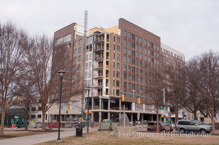
Residence Inn construction site, January 2017
Checking in on the progress at the Residence Inn on Salisbury Street. Most of the exterior materials are in place and the hotel is planning to be open this Spring.
I can’t say I’m very excited about the color palette used on this project, especially on the rear (west facing) side of the building. When someone posts an updated “money shot,” you’ll see the Residence Inn looking so bleak, so boring, that it blends in, almost out-of-sight from the view on South Saunders. (I don’t have a photo but when I see one, I’ll post it in the comments)
Here are the colors that I’m talking about, looking at it from Lenoir Street.

A lot of folks clamor for better architecture in this city. What about more interesting color choices? Is beige, gray, and brown paint cheaper than greens, blues, and reds?
Comments
Comments are disabled here. That's because we're all hanging out on the DTRaleigh Community, an online forum for passionate fans of the Oak City.

I agree the colors aren’t exciting. This will be a huge improvement for the south end of DT, though. Hopefully the NC Chamber and Teachers union buildings will follow with something at least as tall, that includes an active street level. South St could be a good retail street in a few years.
Is this hotel to have any first floor retail space?
Yup, and a rooftop bar. http://dtraleigh.com/2014/08/updated-renderings-plans-new-convention-center-hotel/
OMG, that backside pattern and colors are horrendous. It looks like 1977 and not in a good (hip) way. Ugh.
So, the rooftop bar doesn’t face the skyline? #fail
Yes, what were they thinking with orientation of rooftop bar?! Hopefully one day it will at least offer a nice unobstructed view of our new stadium.
When the state legislature takes away cities ability to have design standards, this is the result.
Design standards are just as bad of an idea as height limits. Restrictions placed on developers are never a good idea.
I am also not a fan of this color. I think it’s brown brick?
I hear ya Leo. I don’t hate it, but I understand why it might invoke a “blech:” response. I am ambivalent I suppose. At least it is different than the reddish brick and tan pattern of Paramount/West/All of NC State. Hey the brown also hides tailpipe soot better, which I understand is part of what drove color choices in the 70’s (if my mother is to be believed).
Steve, can you elaborate on the buildings you just mentioned? I thought that whole site was just sold to Exploris for its middle school, which would be south the tracks and not front South street at all. Pretty sure I am missing something, so thanks in advance for clarifying for me.
Mark,
Sure, so the Exploris school development is on the south side of the “Gateway” parcel, (i.e., south of the tracks) but the rest of the Gateway is occupied by the NC Association of Educators, the Raleigh Chamber of Commerce, and a gravel parking lot. Technically only the NCAE building fronts South, but it’s the whole south side of South between the Performing Arts Center and the railroad tracks. They’re the green parcels on the map in this post. http://dtraleigh.com/2016/12/site-plans-show-10-story-building-gateway-center/
Honestly, I feel pretty confident that both parcels will go vertical at some point. Two non-profit orgs with prime real estate aren’t going to sit on it very long if they can get a good price. If I were the Chamber of Commerce I’d sell it and get a deal where I get the top offices in a new tower, since you’d have awesome views of downtown.
Looking at this project on the map I just thought of something…..wouldn’t a perfect place to put a downtown soccer stadium just to the east of this hotel. The 2 empty lots plus the Lichtin Plaza in front of the Duke Energy Center. I agree it wouldn’t be ideal to steal the plaza in front of DEC but does it make that big of a difference in the long run? It doesn’t change the functionality of the performing arts center at all. South Downtown could still be our entertainment epicenter. With the plaza and the 2 empty lots, that parcel of land is plenty big enough for a decent size soccer stadium. Just a thought…
There’s no way that’s happening. The city won’t do anything to break the view between DEC and the Capitol. That was the main driver behind tearing down the old convention center.
@Stew, the hotel’s rooftop revelers will have a lovely view of Cargill for now. DOH!
@Daniel, using mapfrappe, there still isn’t enough room for a stadium if all that public space was sacrificed for a stadium. Even the current WakeMed Stadium doesn’t fit, no less a bigger one
@Steve, you are correct. That view from the Capitol to Memorial won’t be compromised.
@Mark, I don’t have a problem with the color of the brick. It’s that awful brown and tan “T” pattern in (what appears to be) stucco panels on the back that I can’t stomach.
There is something very monolithic and ominous about that “T” wall. ugh.
I agree that the hotel looks hideous. It doesn’t really look like the rendering at all.
Oh gotcha Steve…I thought I was missing some announced or submitted development. Thats a good frontage to get some urbanity for sure, including height, at some point.
John532, whoops, I glance right past your main point earlier. That T does sort of remind me of my parents brown shag carpet pattern growing up. They should have hired Steve Schuster’s folks to do another shimmer wall level something back there. Maybe even perch the time and light tower up there…
Also yeah, no stadium will ever go in front of Memorial Auditorium, and given that those lots have not come back up to be for sale again (since the auction period passed like 10 years ago), I’m starting to think the City really is thinking about leaving them open in some manner, maybe even as green space.
@Mark. I’d love to see the city submerge the parking underground (if needed at all) and then have a park in its location.
I’d love something like Fountain Square in Cincinnati or a mini Union Square.
I walked by it Saturday getting breakfast at Living Kitchen (love that place, btw!) I actually thought it looked pretty decent in person. It isn’t exciting, but seemed classy and subdued, which isn’t a bad thing for infill. I want skyscrapers and amazing architecture very much, but I’m not usually a critic when it comes to the design of new buildings if they’re not bland stick-built 6-story apartments. It’s a hotel I’m never going to stay at. It provides a function, fills in a parking lot, and isn’t gross looking. I’m satisfied.
agree about the rooftop bar. that’s goddam idiotic, and i thought so when they released the first rendering a few years back. still gonna visit it tho! :-p