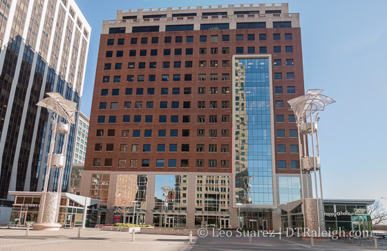
In case you haven’t seen it, the facade upgrade on One Hanover Square is finished. The columns from the previous build were removed and the outdoor space feels much larger. It gives City Plaza a modern feel as it more matches the renovations that took place to the plaza, especially the light towers.
Comments
Comments are disabled here. That's because we're all hanging out on the DTRaleigh Community, an online forum for passionate fans of the Oak City.

It looks better but it’s still one of the ugliest buildings downtown. I know this won’t happen but I just wish they’d start over, tear it down and build something new.
The lobby and several floors went under major renovation too. Bank of America is moving out so I’m assuming we’ll see a new sign on the building soon. I think Kimley-Horn, who designed City Plaza, is moving in soon so maybe they’ll get the naming rights.
This building was a good example of the second phase of Postmodernist architecture, popular in the late 1980s. Now it is a good example of a mess. It is neither fish nor fowl.
You guys are so opinionated! Haha, I think it looks fine.