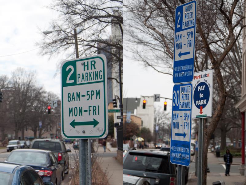
Examples of parking signs. Hourly on the left, metered on the right.
I get asked for help all the time while walking the sidewalks in downtown Raleigh. People ask me for directions most of the time but sometimes for an ATM location or for a nearby place to eat. This happens either because I walk so often or I just have a friendly face. My bet is on the first theory.
Another question I get asked about a lot are parking related questions. You may have seen this exact scenario yourself. A person banging the buttons on the parking meter like it was an arcade machine. That person looks like they are losing. They are losing because it’s the weekend and it hasn’t hit them that parking is free.
The frustrated parker is a common occurrence in downtown Raleigh and the plethora of signs on each block are responsible for informing a visitor of the rules. I’m going to say it straight up that there is a lot of room for improvement in signage around downtown, not just for parking but we’ll stick to just one topic for this post.
This is why a project by Nikki Sylianteng caught my eye. Highlighted in The Atlantic Cities, the New York City designer is attempting to make the parking signs more informative there. Nikki built a prototype and put it out on the street with a comment box for real-world feedback.
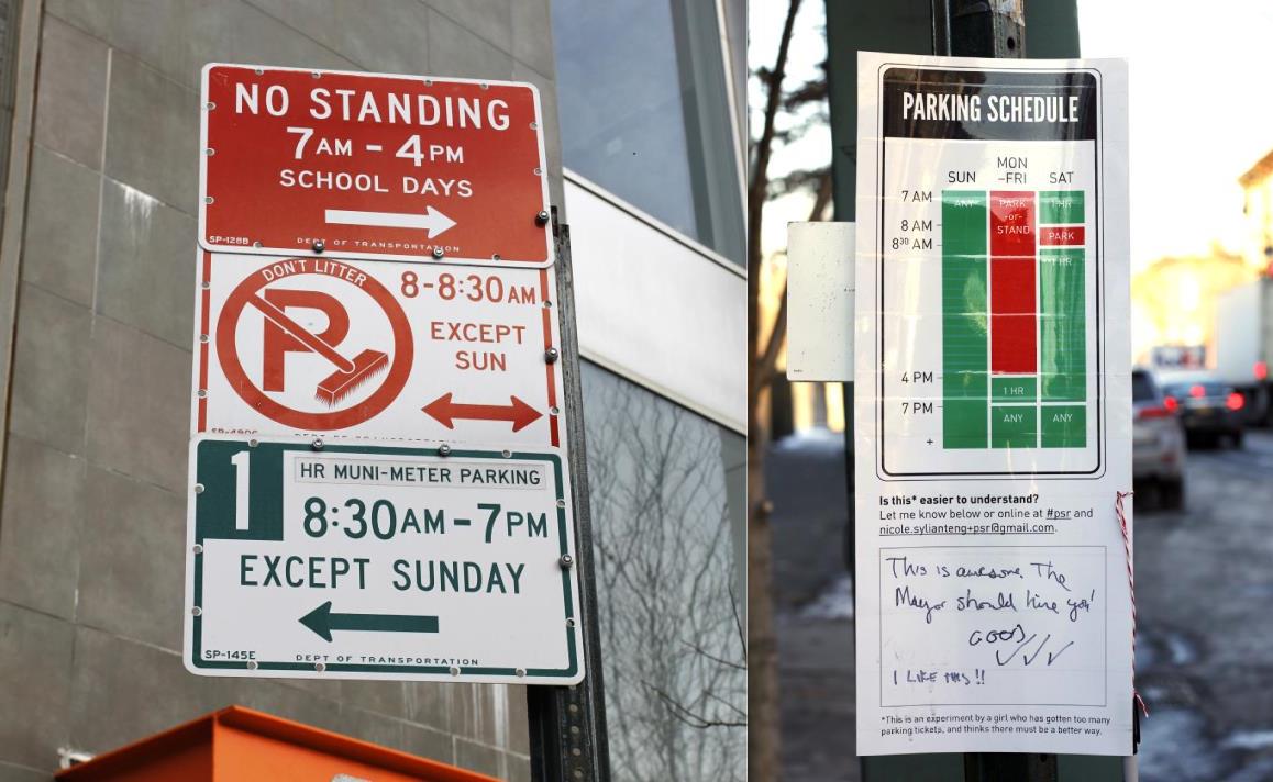
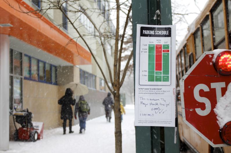
Here are some photos of Nikki’s work, borrowed with permission.

Current city signs on the left and Nikki’s design on the right.

On her project page, Nikki writes:
My strategy was to visualize the blocks of time when parking is allowed and not allowed. I kept everything else the same – the colors and the form factor – as my intention with this redesign is to show how big a difference a thoughtful, though conservative and low budget, approach can make in terms of time and stress saved for the driver. I tried to stay mindful of the constraints that a large organization like the Department of Transportation must face for a seemingly small change such as this.
*Parking Sign Redesign via nikkisylianteng.com
I’ve always thought that the main problem with parking signs is that they do not tell the whole story. For example, the Raleigh signs indicate the hours of enforcement, those being from 8am-5pm, Monday to Friday. They do not indicate what to do outside of those hours. A more ideal sign leaves no doubt during any time of the day, any day of the week.
The Raleigh signs also emphasize the wrong information. “2 Hour Meter Parking” is in the largest font on the sign with the hours being smaller. To the eyes of a driver, the “2 Hour Meter Parking” is most likely all they can read while cruising down the street. With more distractions in downtown compared to the suburbs, drivers have only so long to look at small signs. This portrays that parking enforcement occurs always and the sign is not clearly informing drivers.
What Nikki’s designs show is a 7 day week, 24-hour picture indicating to a parker whether they should be there or not. While the sign is still difficult to read from the driver’s point of view, it more accurately helps someone after they have parked.
During hours of free parking in downtown, I’ve always felt that nervous parkers feel better if they are reassured in some way that what they did was legal. No one wants a parking ticket and this keeps new visitors on the alert because there’s the possibility of a ticket when parking in downtown. Signs must instill confidence in people that they know how the system works and they can avoid the big bad parking ticket.
So there’s clearly room for a design overhaul here. An alternative would be to rethink the parking enforcement system entirely or perhaps throw more technology at it, a suggestion one of our city councilors has brought up.
Comments
Comments are disabled here. That's because we're all hanging out on the DTRaleigh Community, an online forum for passionate fans of the Oak City.

Sounds like a great suggestion. Side note, (but on this topic): Free parking on weekends is a huge part of Raleigh’s charm, I just hope that never changes.
I saw this article on AC as well. I like Nikki’s design and I agree that it needs to be clear at any time of day what you are expected to do. That said, use of plain English would probably do wonders…
1 hr paid parking Mon-Fri 8-5pm
FREE Nights and Weekends
Also, the side of the meters could have more detailed information including on the display, “No payment required until 8am, welcome to Downtown Raleigh.”
Downtown Raleigh might have the most hassle free parking in the entire country. I just look to parallel park because everyone else seems to be afraid or like the above, park for free in a deck.
I have to second Steve on this one. The first time I drove into downtown Raleigh, I fell right into a parking spot on the street. Now, after thousands of times over 25 years, there has never been a single exception. First Fridays, 4th of July – still no problem. I only know where the parking garages are located because of riding in other cars as a passenger.
As for the signs, I don’t have any strong feelings, but if you left it to me, I’d get rid of them all! All of those redundant informational signs and the faux-ancient silver historical markers just clutter my view of the shops, the architecture, and the people.
If I happen to be visiting a strange city with a rental car, I consider it my own job to pre-check what the rules are there. If I forgot to do the homework, I adapt – feed the meter when in doubt, or make whatever decisions are called for. No worries.
I’ll grant an exception for those compact signs with the estimated walking time to various points – I kinda like those!
I love letting my out of town clients know that Downtown Raleigh has free parking on the weekends! I, too, hope it never changes!