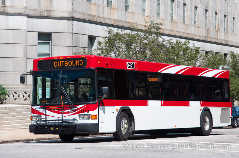
Capital Area Transit (CAT) is currently working on a new branding scheme which will include updated brochures, information, and even a bus paint job. CAT painted a single bus in order to get a real-world look at the design. If approved, the whole fleet may one day sport this red and white design. What do you think?
Comments
Comments are disabled here. That's because we're all hanging out on the DTRaleigh Community, an online forum for passionate fans of the Oak City.
much better look. love the Red and White. go Pack
I like it. Very visible.
Hurricane and Wolfpack red. Outstanding.
The bottom half looks funny because its a white block, They should make it look more integrated with the top design
I like it better than the awful design they have now. The firetrucks in Chapel Hill are blue, I guess the buses in Raleigh should be red and white.
Saw one in N. Raleigh. As a State Fan I like it, but as it went by I had a unnerving urge to go buy a cola. If Coca Cola is not paying for this paint job, CAT screwed up not charging them for ad space.
I think it looks fantastic. Much better update over the 1970s colors they’re sporting now. I wonder if they’re planning on using the white space at the bottom to sell ad space like “big city” buses?
While it is an improvement over the old branding, I don’t really like the red. When I am thinking about transportation, red usually means STOP, and green usually means GO. I would have preferred a green color, or even blue, which tends to have a calming effect on people. Red tends to be a color for being alert or aggressive, neither of which are really necessary for public transit.
Maybe if they get rid of the 2 white strips through the top and may paint the bottom gray. Yeah it’s plain but clean. I do like the design in the front though. My design would be great to allow more buses to carry advertisements on atleast 3 sides of the bus (not in the front). Heck, even Charlotte has started allowing ads on their buses. Time to grow up Raleigh.
Saw this bus on Wilmington st. today during sparkcon…. looks so good in real life.
There is an effort towards better integration of Raleigh’s CAT with TTA.
Areas that have been discussed for integration include: Branding, Route numbering, Website, Stop signs, and fare structure.
Therefore, I get the idea that the big white space on the side has been left for some sort of new branding/logo.
This is several steps short of the integration between TTA and DATA in Durham. I get the impression that Raleigh is going to keep an eye on how things go over the course of several years before deciding whether or not to go for full unification.
I am not a fan. I immediately thought “Wolf Line”. That may be confusing to visitors of Raleigh.
I also don’t see the brand integration with TTA that was mentioned earlier… When I think TTA, I think of the three triangles overlapped on one another… not white stripes.
This is a start.. but where is the other half? I can’t say that this looks good- it looks even stranger in person. A great time to update the brand would have been with the new buses several years ago instead of staying with weathered looking puke colors.
I think the best change would be to get away from the boxy rectangular style and something more sleek, curvy, and modern looking. It would give a feel of improved quality and a more advanced system. Although that would be a substantially more expensive upgrade than some paint jobs. I think whatever they do to the bus design should be mimicked in the renovation of the Moore Square bus terminal to really reinforce the brand.
[…] promotion campaign for Raleigh’s CAT bus service (the current brand is not sexy, although the new logo and paint scheme are a step in the right direction). For express buses to work, though, these buses need to truly […]