Municipography is a summary of current issues going through the Raleigh City Council and other municipal departments in the city. The point is to try to deliver any video, photos, and text associated with the discussions happening at City Hall or elsewhere. Since this is a downtown Raleigh blog, the focus is on the center of the city.
I recommend email readers click through to the website to see the embedded video.
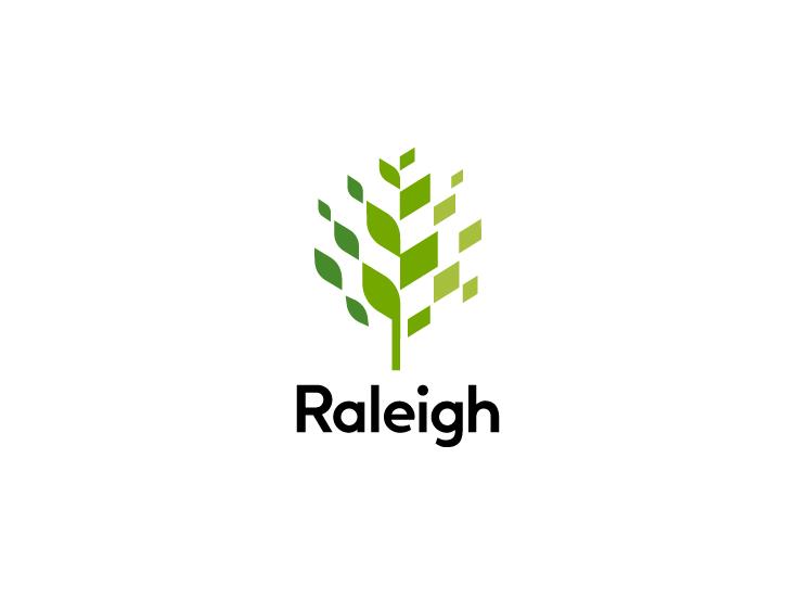
The City of Raleigh government’s latest logo
During this week’s city council meeting, a major update was announced and approved in the long-time process of revamping the city’s brand. The city government now has its first logo, shown above, and will be implemented across the city’s departments.
Not to be confused with the City of Raleigh seal acting as a logo, the new logo will be used in a variety of ways complimented with custom typography (Raleigh Bold) and even future icons that represent the new mission and vision statement.
The logo is for the city’s government and not for tourism.
The presentation given during the council meeting is a good one to watch for more details and I have it embedded below. If you can’t see it, click here to go to YouTube.
Social and news media certainly likes to highlight the plethora of criticism about the new logo. You can’t help but comment when you consider that $226,000 went into the process of creating it.
I don’t have the eye to criticize the logo itself but I do want to elaborate a bit on this cost, a cost that I see well worth it and there are critical things I think folks are missing.
If Raleigh wants to be a national player in business recruitment and even be well represented at some international conversations, a well-thought-out and high-quality brand is a must. To get that, a thorough process that takes community feedback to guide the design team towards this logo “package” is an equitable approach.
The cost wasn’t just for that tree at the top of this post but for an in-depth process to get the pulse of Raleighites and represent that in a simple and effective logo. The feedback collection process was actually a larger share of the cost compared to the actual design work.
For me, I felt like I saw huge value in the logo’s versatility with this video that shows how it can be used in a variety of ways. I can picture print, media, and video incorporating it in consistent yet slightly different ways than the next. If you can’t see it, click here to go to YouTube.
As the branding package rolls out, I think then that more and more people will see the value here. I’m happy to see us tackle a topic that is so subjective and come forward with something strong.
Bravo to city staff who played a role in getting this out there! (and how can I get Raleigh Bold on this website!)
Comments
Comments are disabled here. That's because we're all hanging out on the DTRaleigh Community, an online forum for passionate fans of the Oak City.
Thank you for a thoughtful article. I happen to like the logo and “got” the building reference in right of the logo. Not too much to add other than to amplify your point about the big cost being the analysis and not just drawing a logo. Also, if you want an example of how bad going cheap can be, look no further than the recent horrific State Commerce “Nothing Compares” logo.
Ralwegians*
I don’t get all the fuss about this. I like the logo. It’s clean, simple, and modern. And I don’t expect artists to work for free, so the cost is a minor issue for me. That’s less than a dollar per resident for the logo. Big whoop.
I think if more people could see this city meeting video it would help them overcome their fears or concerns of the money spent as i think it was a good investment and choice. Wow! That was a long run on sentence…Lol
Thank you Leo:-)
I think that I would have preferred that the tree profile was wider and more like an old oak than like one of the trimmed trees along the Cary Parkway.
That said, It’s basically fine. I hope that they find ways to animate it and make it 3D as its use matures.
Curious as to how the promo slogan/nickname “Rising Raleigh” is coming along, if at all being used?!
@Still Bill
‘Rising Raleigh’ would be better than the one being used by the Greater Raleigh Convention and Visitors Bureau ‘Rooted in Raleigh’. Root is Australian slang for sexual intercourse. Good thing we don’t have many Australian tourists.
Thank you for posting these videos and overview. I agree that a broader tree profile would be nice.